
| LandingLens | LandingLens on Snowflake |
|---|---|
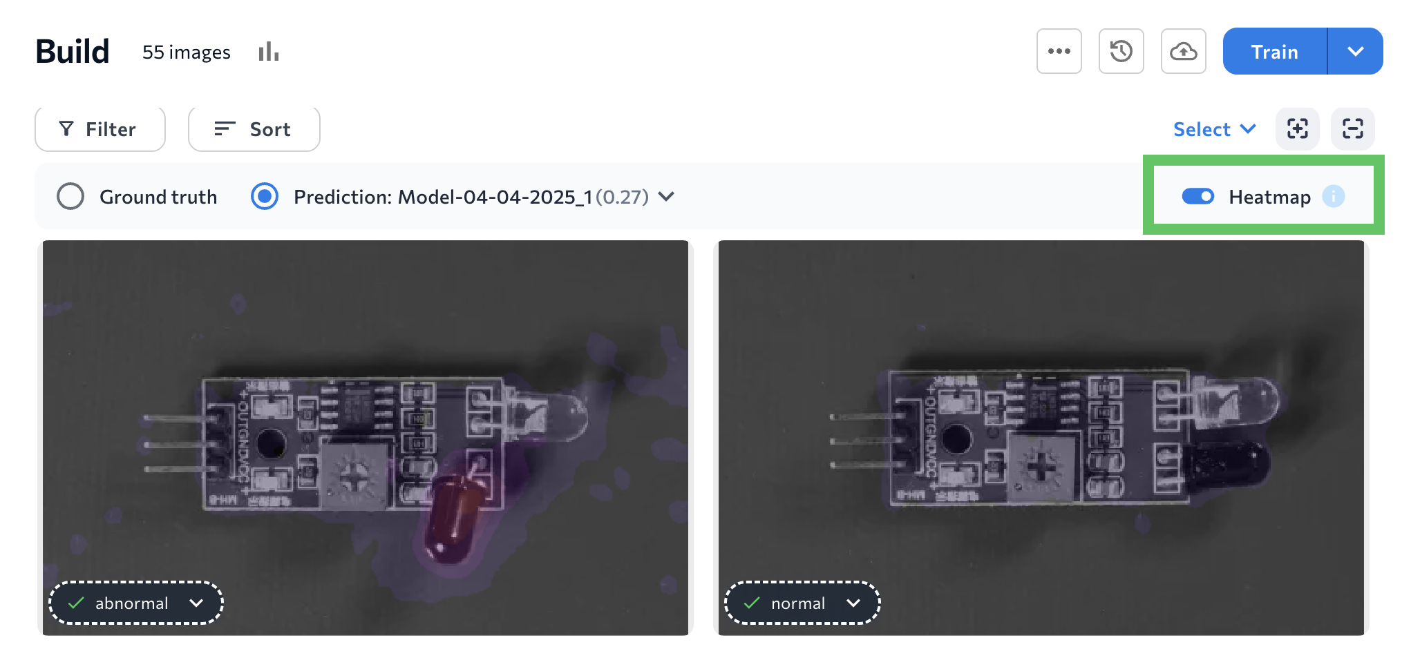
After training a Classification or Anomaly Detection model, turn on the Heatmap setting to see what specific characterstics the model used to make its predictions. A heatmap shows which parts of an image contributed most to the model’s decision.
To see heatmaps, turn on the Heatmap toggle.
Heatmap Colors: Classification
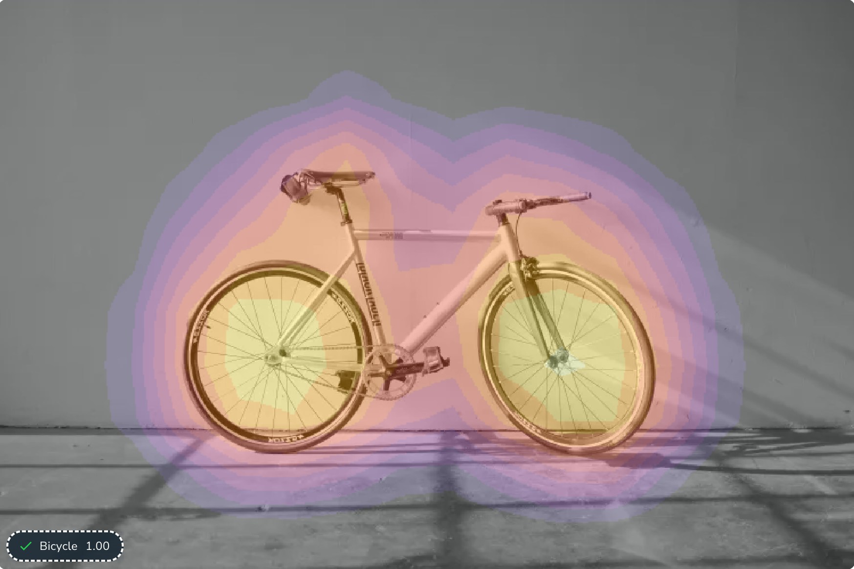
For Classification projects, heatmaps show color intensity to reflect the activation points, which are the specific locations in the heatmap that indicate high activity or interest. The following colors show the degree to which each area contributed to the class being assigned, from most impactful to least impactful:- Yellow: High impact
- Orange
- Purple: Low impact
- Gray: No impact
Heatmap Colors: Anomaly Detection
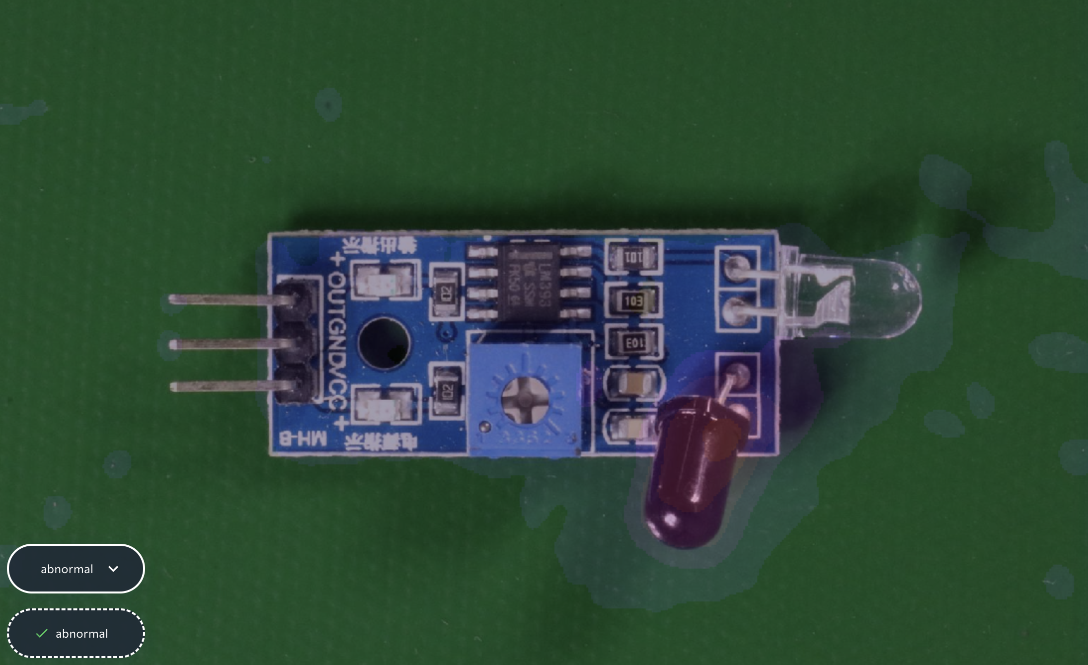
For Anomaly Detection models, the heatmap is a color-coded overlay that indicates which areas the model considers to be “abnormal”. The level of brightness indicates how “abnormal” the model thinks the area is, with a brighter color meaning the area is more abnormal. For example, in the image below, the overlay on the bottom knob is bright. This means this knob’s position impacted the model’s “Abnormal” prediction the most. And the model is correct: the knob is pointing down, but it should be pointing right.